Friday, December 30, 2011

AlphaBeasts - K is for KONG

Another entry that fell victim to time. I had high hopes for this piece, but in an effort to get one turned in on time and not fall two weeks behind, I had to scrap a lot of the aspirations I had for it. Maybe it'll be something I revisit down the road.
I was hoping to throw in silhouettes of the jungle and NYC on either side of the bust integrating them into the fur. I also went black happy with my copic wide marker and left little-to-no room for blending via cross hatching, so I feel like I missed a few opportunities here in the name of completion. Ah well, it was fun!
Anyway, here he is...KONG!

Sunday, December 18, 2011

Charlotte Comicon sketches.

I did a couple of sketches today at Charlotte Comicon in between selling stuff. Thanks to Herc, Jonathan, Brandon, and Henry for a fun day.

Saturday, December 17, 2011

Charlotte Comicon - Sunday, Dec. 18th 10am - 4pm

Looking for something to do this weekend? Still have shopping to do before the holidays? Well look no further! The Charlotte Comicon will be held this Sunday at the Crowne Plaza Hotel in downtown Charlotte from 10:00 am to 4:00 pm. There will be great deals on comics, books, art, toys, movies, sci-fi & fantasy memorabilia and much more! And if that's not enough, a ton of local artists will be on hand selling their books and art!

Swing by and say hello, I'll be set up with Henry Eudy selling our 11 x 17 Darkwing Duck print (see attached pic) and sketchbooks. Henry will have a selection of his mini comics and I'll have all of the Big Dog's Studio sketchbooks and the Sketch Charlotte Anthology. We'll both have original art for sell and will be sketching at the show.

Along for the ride we'll be sitting next to fellow Sketch Charlotteans Herc Petmezas, Stan Ford and Jonathan Rosenbaum! They'll al have something special for sale along with original art, comics and trading cards!

For more information visit: http://www.charlottecomicon.info/

Monday, December 12, 2011

AlphaBeasts - I is for Ithorians

Always did like ol' Hammerhead from the original Star Wars trilogy. As I was searching for some references I found some really cool concept art from which I used for the basis of the head (it's about 1/2 down on the SW wiki page).

I went nuts on the hatching at Sketch Charlotte on Thursday night and was going to submit just the head. But the guys talked me into fleshing it out a bit more, so last night I had some extra time and I drew the rest as I watched a movie with my wife.

Copic markers on 70# tab stock - 8 x 10

More about Ithorians:
http://starwars.wikia.com/wiki/Ithorian

Friday, December 9, 2011

Let's Get Dangerous!

This is a piece I was commissioned for a few months back. They wanted a Darkwing Duck/Captain Carrot team up. As the thumbnail stage progressed I started adding characters. Pretty soon I was up to my ears in cartoon characters!The left piece is a bad scan of the pencils and the right side is the finished piece inked beautifully by my incredibly talented friend Henry Eudy! The guy waited a while for it, so I figured why not take it up a notch with Henry's inks? It was so worth the wait! If you haven't seen Henry's work you really owe it to yourself to spend all day looking at all those wonderful little lines he conjurs, not to mention the sense of humor and storytelling ability he posseses...top notch!I hope you enjoy this 1/2 as much as I do! :)

Thursday, December 1, 2011

AlphaBeasts Catch Up: F & G

Time for some #AlphaBeasts catch up! :)

F is for Fomorians - #AlphaBeasts

I was out of town for Thanksgiving so I was unable to get an F in on time, so it stands to reason my G will be late as well! About the Fomorians (from wikipedia of course)In Irish mythology, the Fomoire (or Fomorians) are a semi-divine race said to have inhabited Ireland in ancient times. They may have once been believed to be the beings who preceded the gods, similar to the Greek Titans. It has been suggested[by whom?] that they represent the gods of chaos and wild nature, as opposed to the Tuatha Dé Danann who represent the gods of human civilization. Alternatively, they may represent the gods of a proposed pre-Goidelic population of Ireland.They are sometimes said to have had the body of a man and the head of a goat, according to an 11th century text in Lebor na hUidre (the Book of the Dun Cow), or to have had one eye, one arm and one leg, but some, for example Elatha, the father of Bres, were very beautiful. Bres himself carries the epithet "the Beautiful."

I opted for the goat headed man for this excercise! Done in two parts (the head and the body) then photoshopped together. I added the font and printed out the assembled piece to do some last minute touch ups. I scanned the finished piece in and was going to do more photoshop, but found some really neat half tone dots from scanning a printed piece. I think they go well with this, so I left them in!

Actual piece is 6.5 x 9 - copic pens on 70# tab stock

More info:http://en.wikipedia.org/wiki/Fomorians


G is for Gamorrean Guard - #AlphaBeasts

Did this one over lunch yesterday. Only it wasn't detailed at all. Once I had a look at all the outlines it begged for some more lines! So I took it home and did my best Henry Eudy+ impersonation! ;)

The Gamorrean Guard was always one of my favorite figures growing up. Sure I'd play with Vader and Boba Fett, but ol' pighead woudl be right there with them!

Actual piece is 7 x 10 - copic pens on 70# tab stock

More info about the Gamorrean Guards can be found here:http://starwars.wikia.com/wiki/Gamorrean


Feels good to be all caught up...now onto H! :)

Sunday, November 20, 2011

Storm


I know everyone is doing the Alpha-Beasts but the meme hit at a bad time for me to try and participate. I thought about it, but didn't know if I could find the time, and right now, I am just enjoying drawing people right now, and for some reason, super-heroes, especially super-heroes from the 1970s.

Storm was a unique addition to the X-Men in the 1970s. Regal, a little fetishized with her skimpy black leather outfit, and a propensity to be an excuse for peek-a-boo nudity. A lot of artists have a fondness lately for Storm in her 80s punk days, but being a nut for costumes designed by Dave Cockrum, I have to go 70s.

I do like the look I gave her in the drawing, almost like she just realized her picture was being taken. I'm also working on those shadows underneath the characters' feet. The highlights on her lower abdomen seem a bit weird to me, but I can live with it.


Monday, November 14, 2011

AlphaBeasts: E is for Ents

Wasn't quite sure what to do with "E" this week, so after a quick google search at lunch I found: Ents! One of my favorite parts of the LOTR trilogy, the Ents seemed like a good fit. So I started sketching away, this time without reference. I'd almost forgotten how fun it is to just draw. I did this over my lunch break with a Bic mechanical pencil. Very little erasing, or planning for that matter! I threw in the Hobbiton font in Photoshop CS2 for good measure.
Pencil on 90# Index. Drawing itself is 5" x 8.5"
You can out more about Ents from the LOTR trilogy (books or movies) or online here:http://en.wikipedia.org/wiki/Ent

Thursday, November 10, 2011

AlphaBeasts - D is for Dai Tengu

I didn't have a whole lot of time to do a proper entry this week, but I didn't want to miss a week this early in the game. So I just photoshopped the heck out of my original thumbnail (2.5" x 3") I did for this week's entry.


You can find out more about the Dai Tengu here: http://en.wikipedia.org/wiki/Tengu


Pencil on 8-1/2 x 11 tab stock, Photoshop CS2Edit


Wednesday, November 2, 2011

AlphaBeasts - C is for Chupacabra

They say better late than never, but I'll let you guys be the judge of that...here's my #alphabeasts entry for the week: C is for Chupacabra! Did this one on Laurie Williams' recommendation...thanks Laurie! :) 9 x 12 copics on bristol with some photoshoppin for good measure.


Find out more about the Chpacabra here: http://en.wikipedia.org/wiki/Chupacabra

Tuesday, October 25, 2011

AlphaBeasts - B is for Baba Yaga

I went with a straight Mignola interpretation of the Slavic witch. Never really heard of her until then, so I went with what I know! You can find out more here - http://en.wikipedia.org/wiki/Baba_Yaga


I actually got the idea for teh Baba Yaga from Henry's wife Jennifer! Henry drew the Baba Yaga for the Hellboy/BPRD Sketchercise.

Copic markers on 8-1/2 x 11 tab stock...

Monday, October 17, 2011

AlphaBeasts - A is for Abominable Snowman

Seeing Ben Towle's assembled drawings from the previous project made me really want to come up with a motif that could carry on through the entire alphabet. I wasn't sure what to do so I laid out a few thumbnails last week and came up with this on a whim. Trading cards. I thought it'd be a neat project for me to come up with 26 different cards that could be assembled into a set at the end.
While I probably won't produce actual cards I'll most likely do a sketchbook, well, at least I'm hoping to! #AlphaBeasts

Copic pens on 9 x 12 bristol with Photoshop CS2 edits.


Head over and check out all the lil beasties:
http://alphabeasts.tumblr.com/

Monday, October 10, 2011

Tiny Bats

Just a quick post to check back in and try to get things going again. Been a rough month or so drawing wise. I've been out of my zone for quite some time and trying to break in ain't as easy at it may sound!

Here's a Tiny Batman piece I did at the last Sketch Charlotte. Not related to anything, just hope you enjoy it!

Sunday, October 2, 2011

I guess you could tie it into Small Press Creators theme

Okay, so I buy myself this new sketchbook that's really big, probably the biggest I've ever owned. It barely fits in the backpack that I take to Sketch Charlotte. The freedom it grants is that I can not worry about running out of room and then blowing up the sketch on my copier just to piece it together on the lightbox. That's precisely what I had to do with my last Jet-Pack Jenny drawing and more recently, my Wizard of Oz drawing, which will be done as soon as I can get to my lightbox again.

On the topic of Jet-Pack Jenny, I started this drawing at last week's Sketch Charlotte meeting after yet another disastrous start on a Power Girl drawing. I liked it and finished it up over the weekend. I believe it's in the running for the cover of the collected Power of 01.


The second drawing was inked at Sketch Charlotte, but started while I was sitting at HickoryCon last month. The character is planned to be part of my next story Hanamori's Circus. I do believe that I'll be curbing my need to throw a lot of ink down on this one.


Tuesday, September 13, 2011

Smart Press Creators: Bridget Scheide's Brother Nash


The plan is to color this but I have too many irons in the fire right now, so I'm posting it with absolutely no Photoshop work. No thresholding, pencil lines still visible, but I did crop it.

I'm looking forward to coloring this because I want to emulate Birdget's color palette for Brother Nash.


Sunday, September 11, 2011

Small Press Creators: Stan Ford's Jet-Pack Jenny


I have a notion deep inside my psyche somewhere that perhaps, someday, I'd like to try my hand at a newspaper style strip. Something action-adventurey, with a 1940's flavor and a lot of tips of the hat to Milton Caniff and Roy Crane. I think about it sometimes and then decide, "No, I still lack the strength of skills to pull something like that off and not look foolish." Yeah, I'm still a little too lily livered to give it a try but you know who's not? My buddy Stan Ford. Stan has been plugging away at "Jet-Pack Jenny and the Factor of 01" since 2006!! I greatly admire his fortitude in cartooning. Jet-Pack Jenny is smart, layered work with one foot in traditional science fiction soap opera and another in astute social commentary. Plus it's fun to read and, even better, it's drawn by a person with enviable skill and ability. Very often there are dense, muscular lines and pools of absorbing black shadows that draw in the eye of the reader with irresistible gravity. Stan moved to Charlotte a little more than a year ago, I believe, and it has been my pleasure to know him and be constantly astonished by the wide array of knowledge he has amassed about comics and cartooning. Give this little link a good click to check out "Jet-Pack Jenny and the Factor of 01" plus several of Stan's essays and observations on comics culture:
http://www.carpaltunnelpress.com/

Thursday, September 1, 2011

Small Press Creators: Rich Barrett's Nathan Sorry


I'm afraid I'm a touch late in contributing to the Small Press Creators sketch topic here at BDS but, with a vacation now over and several small projects done with, I'm pleased to have had some small amount of time to post up a quick illustration of Nathan Sorry, inspired from a flashback sequence in Rich Barrett's graphic novel/webcomic of the same name (http://www.richbarrett.com/nathansorry/ ). I really like and admire Rich's comic, perhaps more than any other by a local creator. Nathan Sorry is so smart and well-constructed that it is always a delight to read. Rich makes a beautiful brushline that is personable and descriptive without being fussy or overdone. He's really learning how to draw a hell of a beard too. If I had stars or thumbs or whatever to give out, I'd give Nathan Sorry as many as I had on hand. For real, you should give it a read. After all, you only live once.    

Thursday, August 18, 2011

Small Press Creators: Duane Ballenger

To know Duane is to love Duane. It really is that simple. He's one of those WAP guys who just can't help being good people. He produces some of the funniest mini comics this side of the Atlantic. And his shirts are legendary even if they rarely come in "big boy" sizes! ;)

This drawing is a direct rip off of one of his shirts that I'm waiting to get in a big boy size at hopefully the next Heroes Con. It's a small snapshot of his work, yet speaks volumes of his sense of humor.

Hard to track down on the interwebs, Duane can be found at local cons throughout the Carolinas. Do yourself a favor and stop by his table at the next show. Buy a few minis, get a shirt or two and talk comics with one of the good guys!


Wednesday, August 17, 2011

Big Dog Down Under!

Things were starting to get stale around here, so I decided to post a commission I did for a buddy of mine in Australia. Can't believe I haven't posted this one yet, but to knock the dust off the place, here's Batman and Catwoman for Andrew!
Copic pens & markers with white acrylic on 9 x 12 bristol.


I'm hoping to get back on track with the art posts. The current theme (Small Press Creators) is very important to me and there are quite a few people I'd like to showcase.

Monday, August 1, 2011

Happy Birthday Seth!


Teamed up with Henry Eudy for a birthday present for our buddy Seth Peagler. Seth is a huge Rocketeer fan, so we decided to draw Butch ( a la Dave Stevens) for his birthday! I left the pencils fairly open so Henry could do his thing...and that he did! He really elevated the piece with his rendering while keeping the basis of my pencils intact. Something you can't ask any more of from a team up. Had a lot of fun drawing it, but even more fun seeing where Henry ended up taking it!

Thursday, July 28, 2011

Small Press Creators: J Chris Campbell!

Shouldn't comics be fun? Shouldn't drawing comics be even more fun? That's precisely what J Chris does...he has FUN! And it really shows in his comics. In addition to being a purveyor of fun he's also the publisher of Wide Awake Press (WAP). Home to some really unique creations by some of the nicest, most talented people working in Indy comics today! (Hopefully we'll get around to featuring a few of them in the coming posts!)

This is a sketch I did of a combo of J Chris' Attic Bugs and Neatobots - more fun than I've had in quite some time!

Head over and check out what J Chris
is up to
and see what goodies WAP has in store for you!

Monday, July 25, 2011

New Topic: Small Press Creators!

Shifting gears from the previous topics, this one is aimed at the unsung heroes of comics: the small press creators! To get the ball rolling here are three pieces I had in the hopper...

- Chris Schweizer's Crogan Adventures
Chris has created something truly unique and quite magical. Each book focuses on a member of the Crogan family and their historical place in the Cragan Adventures. The art is whimsical and the action is breathtaking..I cannot recommend this highly enough! If you have kids, are a kid at heart or if you're a fan of historical action this series is well worth your time!

This piece is a warm up study I did of the main character from the first volume: Crogan's Vengeance - Catfoot Crogan


- Andy Runton's Owly
What could I possibly say about Owly (and Andy) that hasn't already been said? An amazing, well executed premise that is heart warming and simply loads of fun!


- Troy Hasbrouck & Jester Press' Night
This piece is a pin up I did for one of Troy's convention books from a few years ago. Night is the brainchild of local creator/LCS (Rebel Base Comics & Toys) owner Troy Hasbrouck. It's an action packed comic that boasts not only vampires & werewolves but zombies and even minotaurs!


Sketchbook for my Son...Little Dog!

I saw Jeremy's drawing of Big Dog over at his blog announcing his participation over here and just loved it! So I asked if he could do a puppy version in my son's sketchbook. He did me one better and drew Lil' Dog playing with Big Dog...LOVE IT!

Thanks Jeremy! :)

Thursday, July 21, 2011

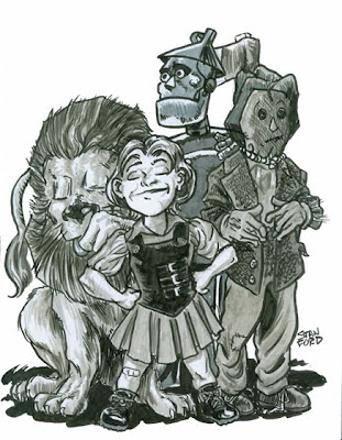
Oz


Again, not along the lines of any themes, but I needed to do a card for one of my in-laws, and this one jumped out at me tonight as needing to be finished.


Tuesday, July 19, 2011

Alan Moore Creations: From Hell

From Hell is a series I hold in incredibly high esteem. It's a very complex and layered story that Alan Moore and Eddie Campbell attempt to tell. They start with stark facts, the history of a series of atrocities, stark and frightening enough on it's own, and they start to ply on ritual, metaphysics, majik, literature, mythology, the highest and lowest of human ideals muddled together in a story that leaps out of the 19th century and binds itself both with the primeval and the the modern states of mankind. I love the footnotes at the end of each issue. Very often they show you very directly how Moore was thinking as he wove along the back alleys of Whitechapel, picking up inference and inspiration from all points in time and culture like an occult magnet.

Eddie Campbell's art pairs so well with the story. I love the kinetic energy in the drawings, with stray lines and messy knots of black clustered around in the muck and the blood and the ash. It suits the time period so well and allows for the beautiful lotus of idea to grow from the festering cesspool by first illustrating the filth and degradation of the place itself. From Hell will probably always amaze me with the depth of its meanings. It is labyrinthine and a reader can run down one of a dozen paths each time the story is read.

Anyway, enough of my rambling on. This drawing here I did of one of my favorite parts in the story, when Sir William had Nedley the carriage driver lead him on an esoteric tour of London. They survey the perverse architecture of the Hawksmoor churches, kneel at William Blake's tomb, ask a blessing from John Merrick and pass by Cleopatra's Needle. All the while speaking of the rites of Dionysus, the old Gods and the world within the world. It's an incredible carriage ride and a great piece of writing that lights up my mind whenever I read it. So, this is my little drawing of the ride. Done with little Prismacolor pens on a piece of sketchbook paper. Not for sale, I'm afraid.

Friday, July 15, 2011

Sketchbook for my Son...part deux

Had a few new entries to my son's sketchbook from last night's Sketch Charlotte meeting. Jonathan Rosenbaum and Bridgit Scheide added some really amazing pieces. Jonathan was running short on time last night, so he's going to ink his next time around. I'm holding off posting that until the inks are in.
Bridgit stepped up to the plate and knocked hers out of the park! Head over and check out Jonathan & Bridgit's work, you won't be disappointed!


edit - the inks are in! Check out Jonathan Rosenbaum's Radar!

Thursday, July 14, 2011

Batwoman

Brandon made me swear to post this on the blog, so here it is, with no tie to any of current threads...Batwoman.


With this I was trying out my shortcut method of drawing characters that wear mostly black.

Tuesday, July 12, 2011

LOOSE ENDS #1

I'm not the one to pimp books, but this is one I believe in. LOOSE ENDS #1 (of 4) comes out tomorrow from 12 Gauge Comics (Diamond order code is MAY11122). Loose Ends is a creator-owned Southern Crime Romance comic from writer Jason Latour and artists Chris Brunner & Rico Renzi. They just all happen to be from Charlotte, so there's another reason why I'm pushing. But if you've seen any of the art from this or were lucky enough to read the ashcan or FCBD offering then you know exactly why I'm posting this. The early reviews from critics and pros alike have been fantastic (see CBR, twitter & devART) And having seen it in various stages of completion, I have to say I agree with them 100%.

Do me a favor. Now I'm not asking you to blindly drop $4 for something you've never seen. All I'm asking is that the next time you're at your LCS, pick it up and just flip through it. In today's landscape of convoluted crossovers it'll be nice having something fresh and original. You can thank me later. :)


And if by chance you live in the greater Charlotte area, there's a release party at Heroes Aren't Hard to Find with an 11 x 17 incentive print (see below) with the purchase of LOOSE ENDS #1! The guys will be there from noon-2:00 pm and again at 5-8:00 pm on Wednesday the 13th.

Friday, July 8, 2011

Sketchbook for my Son...

I've decided to start a sketchbook for my 16 month old son. I know it's a tad early, but I had this small 5 x 7 sketchbook laying around, so why not!?

We had "sketchbook night" at Sketch Charlotte last night so I took it and got a few new sweet pieces to go along with the two awesome pieces I got last week.

I'm asking for cute animals or superheroes, so if you're an artist and I know you...I WANT YOU IN THIS BOOK! :)

Here's what I have so far...

Krypto the Super Dog by Stan Ford


Stinky/Angry/Cute Hulk by Rico Renzi


Honey Bear by Herc Petmezas


Cute Armadillo by Henry Eudy

Tuesday, June 28, 2011

Alan Moore Creations - Ozymandias


I have to confess, I haven't read enough Alan Moore to really latch on to a particular character. However, I have read Watchmen and for whatever reason (the headband), I knew I could have some fun drawing Ozymandias.

Ozy was penciled and inked traditionally, with colors in photoshop. I tweaked a couple of colors on his costume, so I hope the Ozy faithfuls don't get too upset.

Alan Moore Creations - Jack B. Quick

What kind of Alan Moore topic could we have and not mention Jack B. Quick?! My favorite character created by Moore, Jack B. Quick is one of the most entertaining comics I've ever read. Maybe it played on my Calvin & Hobbes heartstrings longing to be pulled, or maybe it's just the midwestern charm coupled with the scientificly absurd...all I know is that I wish, more than any of his other creations, that we'd see more of ol' Jack.
I referenced a few Nowlan drawing for this, but ended up with my own take...kinda makes him look older than in the book.


Copic pens on 5 x 7 tab stock. FREE with any purchase of and Big Dog's Studio sketchbook.

Animal Alphabet - K is for Kingfisher

A few weeks late, but I finally got around to inking this one! Not as happy as I was with the Jabiru, but I'll take it! I'm hoping to either catch up or jump to the next letter. These are a ton of fun and a welcomed break from superheroes!

The original was created using Copic markers on 9 x 12 bristol. I moved the title around for this post using Photoshop CS2.

The original is for sale. Interested parties can gmail me at: BigDogsStudio

Alan Moore Creations - Rorschach

Rorschach blew my 12 year old mind. I'd never seen anything like him in my short time of reading comics. I remember picking it up off the shelf of my LCS way back in the day. I'd heard a lot of people talking about it at the shop so I thought I would give it a shot. I flipped through those issues, but Moore's writing and Gibbons art was wasted on my sensibilities of the time. Yet I gravitated towards the Rorschach character. He seemed like a perverse Batman that did what you thought Batman wouldn't do. While the character was intense and demanded my attention, the story lost me. It was deeper than what I was used to reading and the story felt dirty, so I stopped buying the issues. I didn't read Watchmen as a whole until later in high school and it set my comic book world on its ear. That being said, I don't hold it in as high esteem as most critics do, but I see the importance of it. It'll hold it's place of critical acclaim in just about every discussion relating to comics. But it won't be on my desert island reader's list.

This was done with copic markers on 5 x 7 tab stock - FREE with the purchase of any Big Dog's Studio sketchbook.

Monday, June 27, 2011

Alan Moore Creations - Jeff Smax of Top Ten


One of my favorite characters from one of my favorite Alan Moore creations: Jeff Smax of Top Ten. First time I've ever tried drawing him. Copic markers on 5-1/2 x 8-1/2 tab stock

Rather than put it up for sale let's try this: FREE with purchase of any Big Dog's Studio sketchbook. Volume 3-5 are still available - $5 each with custom sketch (plus shipping). G-mail me at BigDogsStudio if you're interested...


Printed it out at actual size and did a quick marker pass. Then took it into Photoshop for a quick coat of color...

Saturday, June 25, 2011

Alan Moore Creations: Miracleman


As a teenager, after having read "V for Vendetta" and "Watchmen," I went on a tear to uncover other Alan Moore scripted comics sleeping secretly away in the back issue bins of my local comic book shops. This was in the mid-Nineties and the great glut of product from the independent publishing boom of the late Eighties was still lounging around most shops where you could very often buy full runs for just a very few dollars. Thus it was with me and Miracleman. The comic had been published in the U.S. by the now defunct Eclipse Comics and no one cared much about it since it didn't feature a W.I.L.D.Cat or a Spawn or something of that ilk. But these were little treasures to me. I scoured dollar bins and even less that dollar bins and eventually assembled every issue for my collection.

Miracleman still stands as one of the best things I've ever read in comic book form. It so perfectly takes the bizarre logic and mythology of the Golden Age and turns it around into a modern and very human masterpiece. It's a great series that deserves to be sought out and held up as a great achievement in revisionist superhero comics along side "Watchmen" and "The Dark Knight Returns."

This drawing is on 6x9 sketchbook paper, made with brushpens, india ink, white out and markers. Available for purchase for $5.00 by writing me at hank@ohthehumanatee.com.

Alan Morre Creations: Veni Vidi Vicious


I was certainly very enthused when I saw our latest sketch topic was to be Alan Moore creations. Moore's work is fundamental to both the person I am as a comics reader and also, just as a person. Maybe nothing effected me more as a youngin' than reading "V for Vendetta" when I was a high school junior. Never in my life had I felt more oppressed, more frustrated with authority and society, and "V" was the perfect outlet for all my angst. This comic actually did expand my mind (as dumb and hippy-dippy as that might sound) and broadened my concept of what comics as legitimate literature could be.

So, anyway, hyperbole aside, this is my sketch of V with a handy dandy Rolling Stones quote to match. Brush pen on 6x9 sketchbook paper. Like all the other drawings I'm posting here, can be bought for $5.00, contact me at hank@ohthehumanatee.com if interested.

Projectra- 70s Legion

This is just a preliminary, actually gonna work on another drawing a little more evocative and frankly, prettier and in better proportion.